
A Cry For Help.
Which illustration should I send to the Society of Illustrators' Show?

I’m stuck in the muddy muck of indecision and I could use some help.
A couple weeks ago I received the amazing news that I’ve been selected to participate in the Society of Illustrator’s annual Original Art Show in New York City. It’s an exhibit they do every fall featuring the best of children’s picture book illustration. I am thrilled to be included, honored, in fact, having admired this art form for so long from the outside, as a fledgling artist in my college years and lately as a parent sharing books with my son. The caliber and standing of the artists I’ll be hanging alongside is truly awe-inspiring. I’m honored, humbled and a little bit gobsmacked, to tell you the truth, to have this opportunity with my first ever picture book.
Now I have to choose ONE and ONLY ONE illustration to include in the show and I can’t for the life of me decide. I’ve whittled it down to three options. You guys have known me and my work for a long time, way before this Substack phase. I feel confident that this group will make a better decision than me. So please, if you have a little time, take a look at the three spreads below, consider (or ignore) my reasoning behind each, and then vote for what you think is my best option. I really appreciate it.
OPTION ONE:
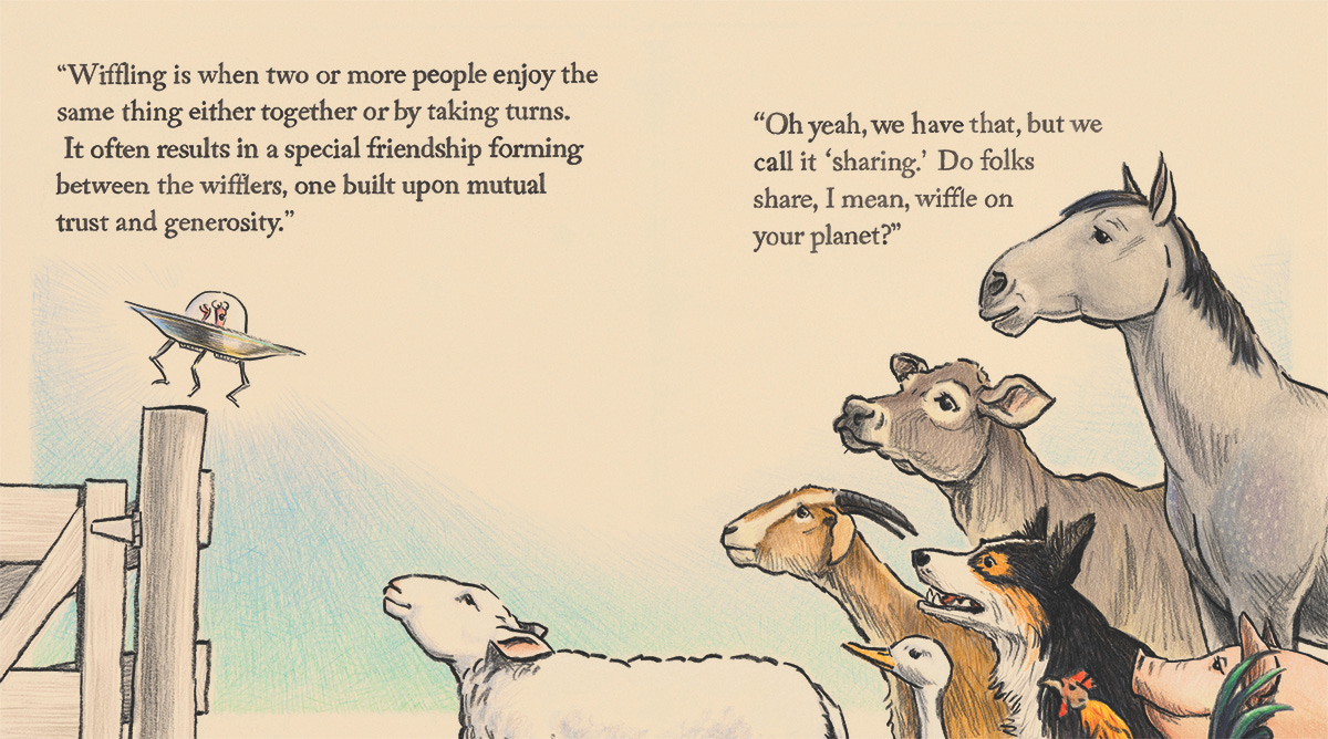
1: I like this one because of the faces and the overall composition. Of all the two page spreads in the book, this one had the most text, a fact that necessitated this choice in the composition and forced the tighter angle on the characters, but I like the way it turned out. The angles lead your eye across the faces (which turned out nicely “alive,” attentive and empathetic) to the focal point, the little saucer guy, who’s talking as he brings his ship down for a soft landing on the fence post. There’s a nice energy in that gap. I’m happy with the drawing of everything here, which isn’t always the case, as you’ll see in the next options. But, I am a little worried that maybe the constraints I had to overcome are making me root for this one more than it deserves. Does it work just as well if you didn’t know any of that? And does this framing make it look like I can’t draw legs and feet? That’s an old artists’ trick, hide the part you can’t draw. And about that text, there’s a lot of it. Maybe it distracts from the enjoyment or impact of the art? Of course the text is part of the “art” too since it’s all hand drawn. Besides, a good bit of the work of picture book illustration is in how you combine text and image on a page so maybe this a good example of the craft. Oh, I just don’t know! At the end of the day, it just needs to look nice in a frame on the wall.
OPTION TWO:
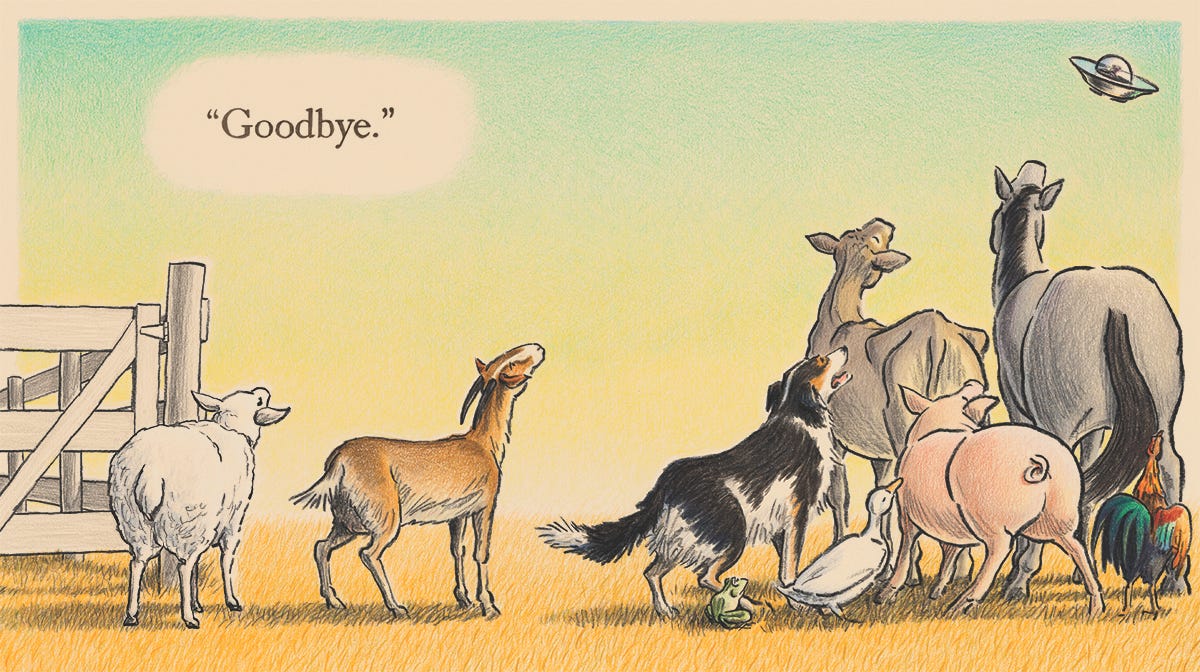
2: This one has the most intense color, which is nice. Similar to the first option, it has a strong angled composition that I like, this time with a lot less text. I like the way the animals are rendered with the one exception of the goat. Particularly the goat’s head. It’s just a little less than perfect in my opinion. Passable, but not exactly right. And is it a negative that you’re seeing most of the animals from behind here? It works for this moment in the story, and in the book as a whole it’s nice to have some variety, but maybe it’s best, if you’re only gonna see one illustration, that it be one that shows the characters’ faces, but then again, this exhibition is about illustration and illustration isn’t only about the art but about how the art works in cahoots with the story. That’s a lot of buts and also a lot of butts. I like this one though.
OPTION THREE:
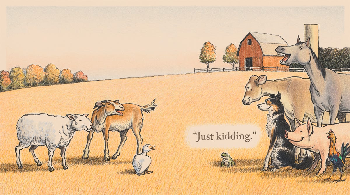
3: This one is the final spread of the book and the only one of these options that shows the entire farm setting. It has a nice warm tone but it’s mostly about the expressions on the faces, which I like, even if they are a little bit cartoony here. Again, it’s what the story needed. I’m getting nitpicky now, but I don’t love how the feet of the sheep and goat look like they’re standing “on” the grass rather than “in” it. I’m talking about all the little negatives I see, which probably no one else notices or cares about. Or maybe you do now that I’ve mentioned it. The truth is I’m almost never 100% satisfied. But for these three, I’m in the high nineties.
What do YOU think?
Please vote in the next twenty-four hours and if you have some specific rationale behind your choices, please put that in the comments. That would be a big help. Fingers crossed, we’ll have a clear winner and I can stop with the agonizing.
Your indecisive friend,
-Matt
Oh my god! Option 2 is really clearly the best piece overall! The color is beautiful, and the gestures are all wonderfully expressive. But what nails it is the way everything about the text and composition taken together reinforce each other. It’s just a really lovely image of “Goodbye” as a human experience.
I wouldn’t have noticed the feet in #3 except that you pointed it out. I chose 3 simply because it immediately grabbed my heart and made me smile. I think it is perfection with “just kidding”. They’re all really very beautiful. Can’t wait to see the book.